Tuesday 4 December 2012

Logo Creation

For Part A of our final prepress module we had to design a logo that tied in with the Australiana theme without using the typical Australian icons like the Sydney Opera House, Ayers Rock and other typical icons.

We had to base our design on the Aussie Battler.  I came up with the idea of an old rickety fence that you see in the farming communities in the outback with overgrown grass.


This is the grey version of my logo
 We also had to develop particular stationery using this design, including business cards, letterhead and with compliments slip.


Presentation of logo and stationery design


Tuesday 20 November 2012

Car Sales Ad

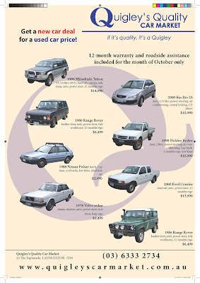
For this learning activity we had to create a car sales advert for a local newspaper which we had to clip paths around the car images.  This way only the car image would show and not the background.

Here is the end product:

Saturday 17 November 2012

Weather Map

I had to recreate a weather map that was supplied for this assignment.

Here is the end product:

T-Shirt Design

For this assignment as part of the symbol design you had to create your own image within a circle and some text for a t-shirt.

Here is what I came up with:

Friday 16 November 2012

Wanted

For this activity we had create a WANTED advert for another client.

Here is what I came up with using the artwork that was supplied and requested to be used by that said client.

Tourism Ad (Magazine)

For this learning activity I had to reduce the image sizes and canvas size of each of the 9 images used.  We then had to choose a font and any colours that would complement this advert for 'Explore Tasmania'.... here's what I came up with:

Colour in Printing and Web

As part of this learning activity we had to trace the original logo design for a fruit shop from a previous learning activity.
Here are the original sketch ideas, I ended up choosing the one on the top left corner:


Original sketch ideas


End Product: Logo Design (2 colours)

 We then had to create various office stationery which included business cards, letterhead and with compliments slips.

Here is what I came up with for those items:


Left: Front of Business Card Design
Right: Back of Business Card Design


Letterhead Design

With Compliments Slip Design


We also had to create a style guide, as follows:


Saturday 13 October 2012

Prepress Terminology


Printing Process Examples

Here are some examples of the various printing processes:


Puzzle Word Search

We had to create a puzzle word search... see how many you can find:

Part B - LA01 Prepress

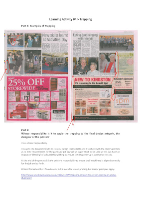
We had to then reserach two printing processes and identify which would be the best to print a magazine, here is what I came up with:

Prepress Learning Activity 1 - Video

As part A of the learning activity 1 for prepress module, we had to answer some questions on a video that was sent to us.

Here are my responses:


Wednesday 26 September 2012

Imposition - Typo Book

For this learning activity we needed to research and put together a min of 4 Typography Do's and 4 Typography Don'ts.

Here is what I came up with:

Mock-Up Page 1

Mock-Up Page 2

Tuesday 25 September 2012

Annual Report

I have recently completed the design for Kingborough Council's Annual Report.

Simply follow this link to view:
Kingborough Council Annual Report 2011-12

Tuesday 18 September 2012

The Graphic Design Process

For Prepress Learning Activity 2 we had to recreate the graphic design process map.  I chose a very basic design for this process map which would be easy to follow.

Saturday 8 September 2012

Poster (Primary School)

Another activity was to design a poster that primary school children could understand, here's what I came up with:

Water Poster

As part of our sustainability module, we had to create a poster for a office/work environment to use more sustainable practices.

Monday 20 August 2012

Photobook - Final Assessment Part B Tech 3

Here is my photobook - what do you think

Photobook - Part B Final Assmt Tech 3

Magazine - Final Assessment Part A Tech 3

Hi all here is what I came up with for Part A for the Final Assessment for Technology 3.

Only basic steps but hopefully it is easy to follow!

Let me know your thoughts.


Sunday 19 August 2012

Photobook

Here is the link to my first attempt at my very own photobook! Pages do flip a bit fast... will need to work on that a bit more I think!

Photobook

Thursday 2 August 2012

Workplace Signs

This was the first part of the final assessment for the OH&S area.... my drawing still has quite a way to go especially with the goggles!!


Induction Process for New Employees

As one part of the final assessment task for the occupational health and safety component, we had to do up a slideshow to cover OH&S as part of an inducation program from new employees as well as serving as a refresher for current employees.

Here's what I came up with: Slideshare - OHS Induction for new employees

Thursday 28 June 2012

Drawing with type

With this assigment you had to use type-on-a-path tool.  I really liked this but I couldn't find out where to fix my kerning when in illustrator.... maybe this is because I have a newer version and looks different than the examples provided in the assignment notes/activities.

I used three blind mice as mine.  Let me know your thoughts!

Wednesday 27 June 2012

Photo Word Composition

For this assignment you needed to make up a word using alphabetical shapes.  Can you make out the word I spelled? Let me know.  I found this one hard to get the right pictures to help with the word I chose but gave it a shot!


Here's my second attempt to try and use more of a theme.... let me know if you can guess my word (it's pretty simple really).

Tuesday 19 June 2012

Producing a Flyer

Here is the front and back images of my flyer for the cats home.... just very basic but not bad for my attempt using the map side of things through illustrator... I could improve images and the whole design layout (I just ran out of time!!).


Front Page


Back Page


Sunday 17 June 2012

Tas Map

This activity required me to use Illustrator.... not bad for my first attempt! I think if I changed some colours it would improve the look of the map.  I found that I had to move layers around depending on what I wanted to have up front and what I wanted in the background.  I found this task very challenging.

Let me know what you think.

Technology 3 Learning Activity 07 - Tas Map

Saturday 9 June 2012

Scanner Guide

Hi all here is my scanner guide assignment for Technology 3 - Learning Activity 6.